
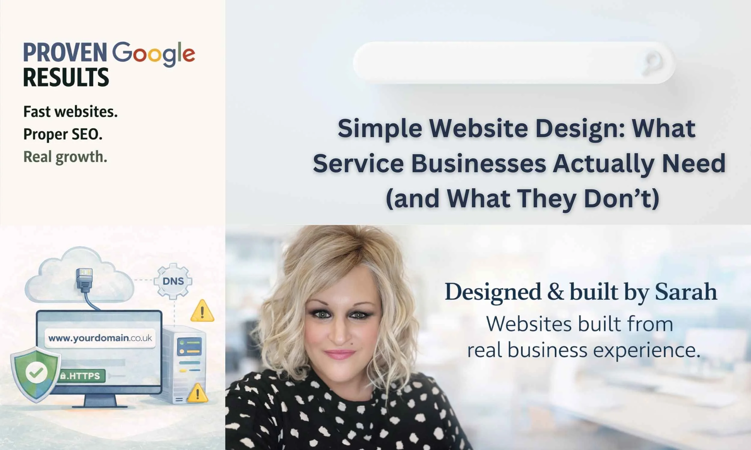
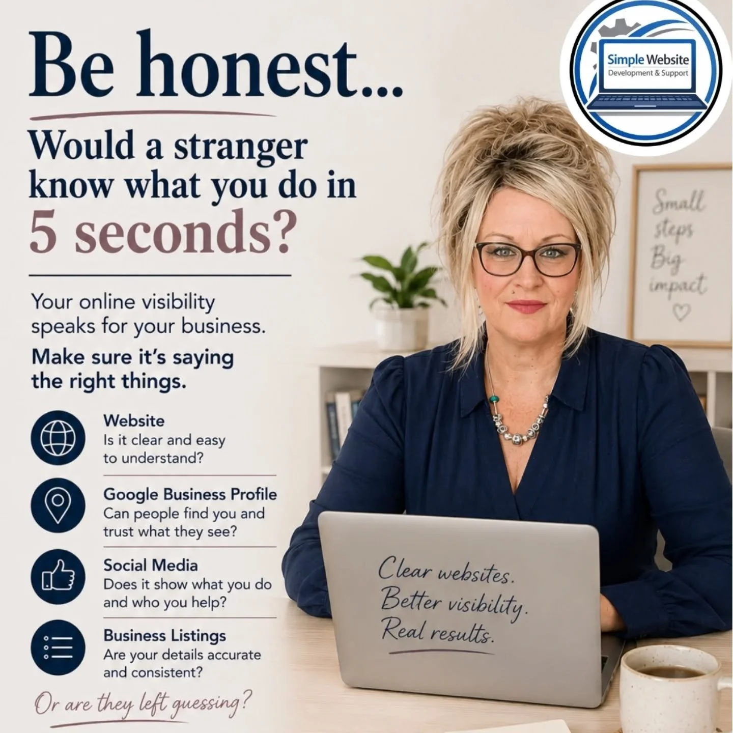
Simple Website Design: What Service Businesses Actually Need (and What They Don’t)
If you’re a service business owner thinking “I need a website”, you’re not alone.
Most people don’t start a website project feeling confident. They start because customers are asking for a website, their current one isn’t working, or they’re tired of explaining what they do over and over again.
There’s a lot of noise online about what your website should look like and what it must include. The reality is much simpler.
Most service businesses don’t need more features.
They need clarity.
I Need a Simple Website – What Does That Actually Mean?
When someone says “I need a website”, they’re rarely asking for something flashy.
They usually mean:
They want to be found online
They want people to understand what they do quickly
They want enquiries without friction
They want to look professional and trustworthy
A simple website isn’t about doing less.
It’s about doing the right things well.
What Service Businesses Actually Need From a Website
Clear messaging in seconds
Visitors should understand what you do almost immediately. Not clever wording. Not jargon. Just clarity.
Easy ways to contact you
Phone number, form, email — visible and easy to find from anywhere on the site.
Fast loading pages
Speed matters more than design tricks. Especially on mobile.
Content that answers real questions
Clear service pages, helpful explanations, and FAQs reduce hesitation and build trust.
Trust signals
Testimonials, clear language, and a human tone matter more than slogans.
Simple, logical structure
Clean navigation and pages that follow how people actually think.
A website Google can understand
A simple website isn’t just for visitors — it also needs to make sense to Google.
Clear page structure, plain-English descriptions of what you do, and service-focused pages help search engines understand your business properly. Good SEO for service businesses isn’t about tricks. It’s about clarity. When Google understands your business, it’s far more likely to show your website to the right people.
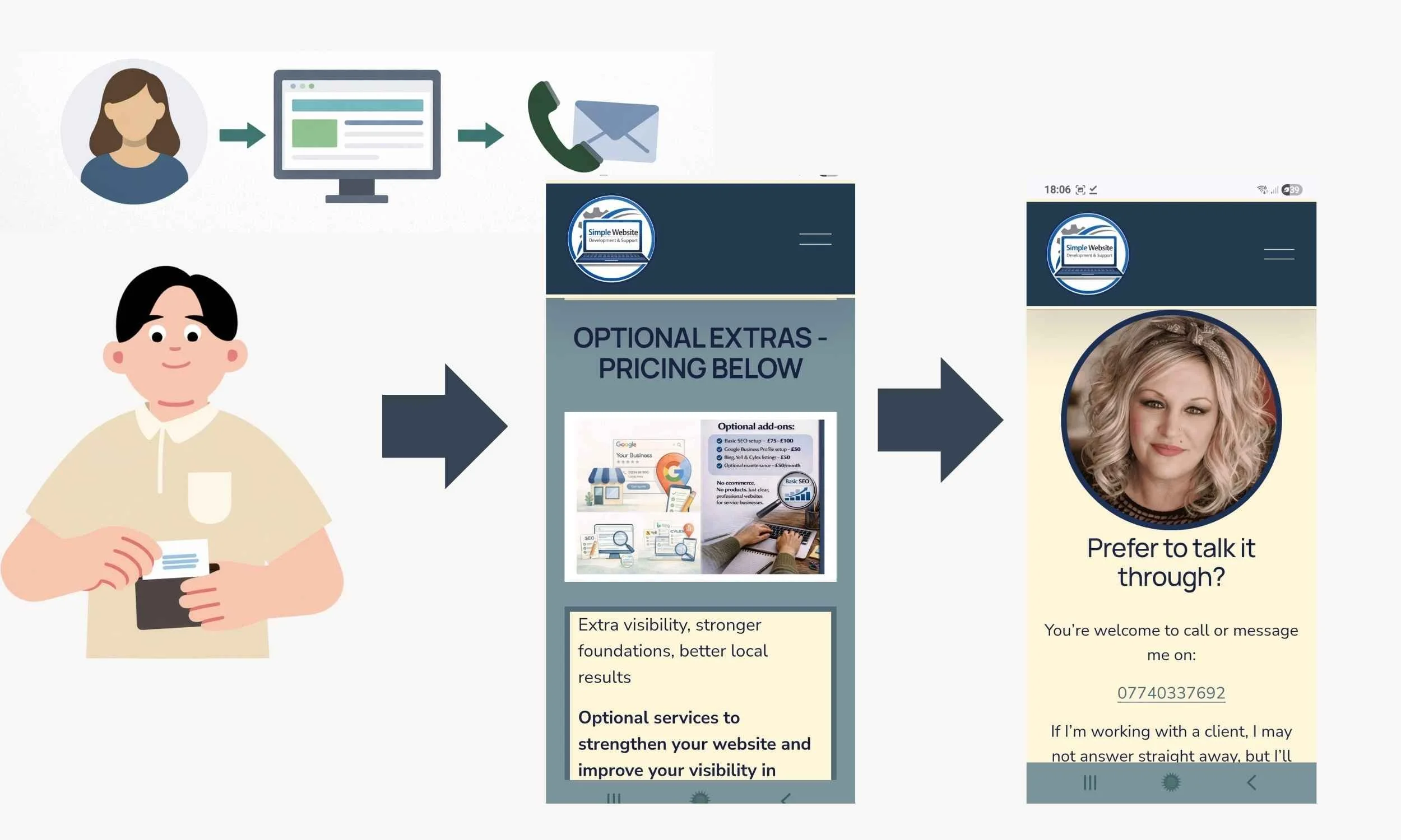
Flow diagram showing how a good website guides visitors to contact you, book, and make a decision to purchase services or products.
What Service Businesses Don’t Need From a Website
Most service businesses do not need:
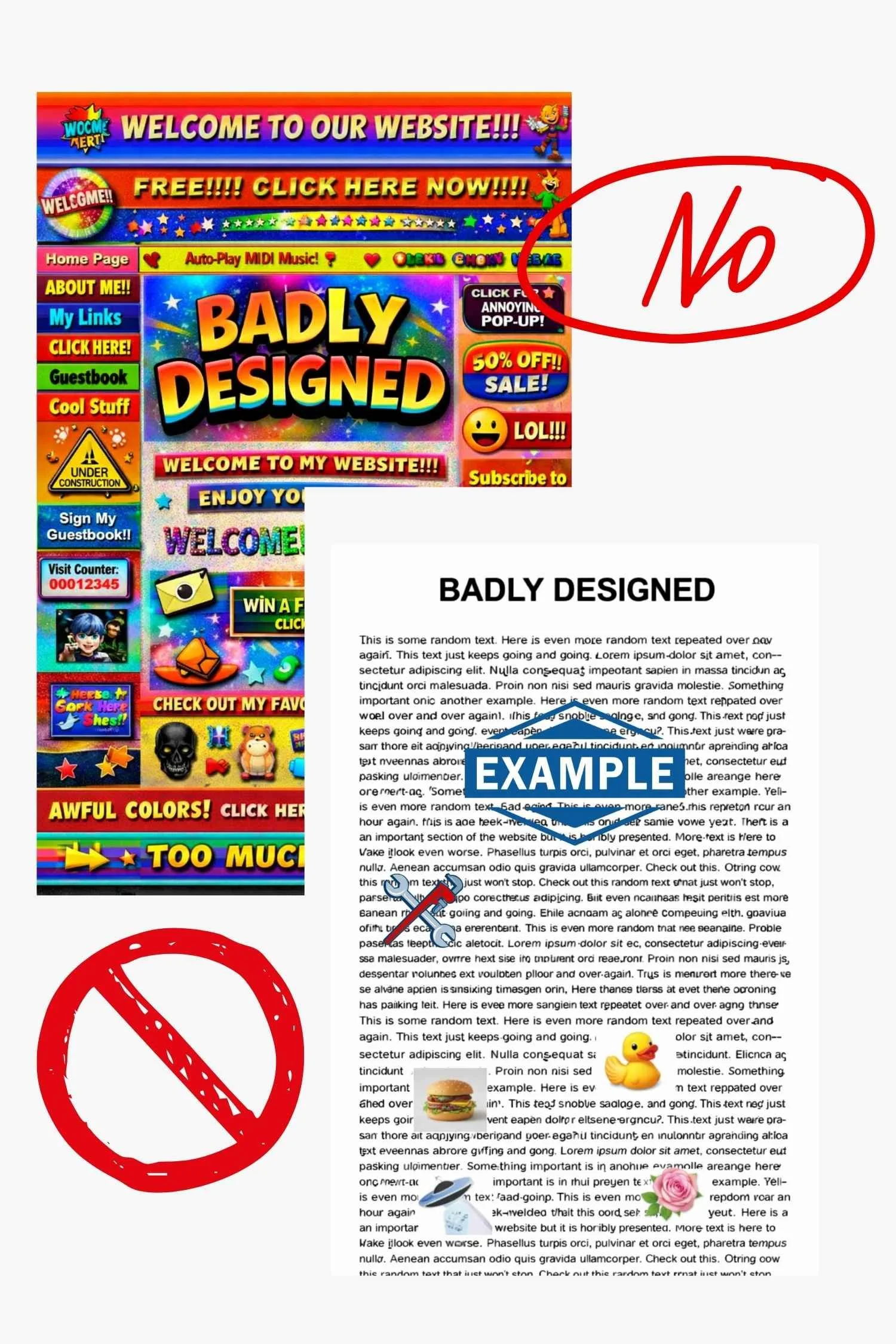
Endless animations or effects
Overdesigned layouts that distract from the message
Complicated menus with too many pages
Features added “just in case”
A website only a developer can update
Trend-led design that dates quickly
Simple doesn’t mean basic.
It means intentional.
Why Simple Websites Convert Better for Service Businesses
Service businesses rely on trust.
Visitors are usually asking themselves:
Do I understand what this person does?
Do they sound credible?
Do I feel comfortable contacting them?
Clear structure, calm wording, and simple layouts reduce decision fatigue. That’s why straightforward websites often outperform complex ones.
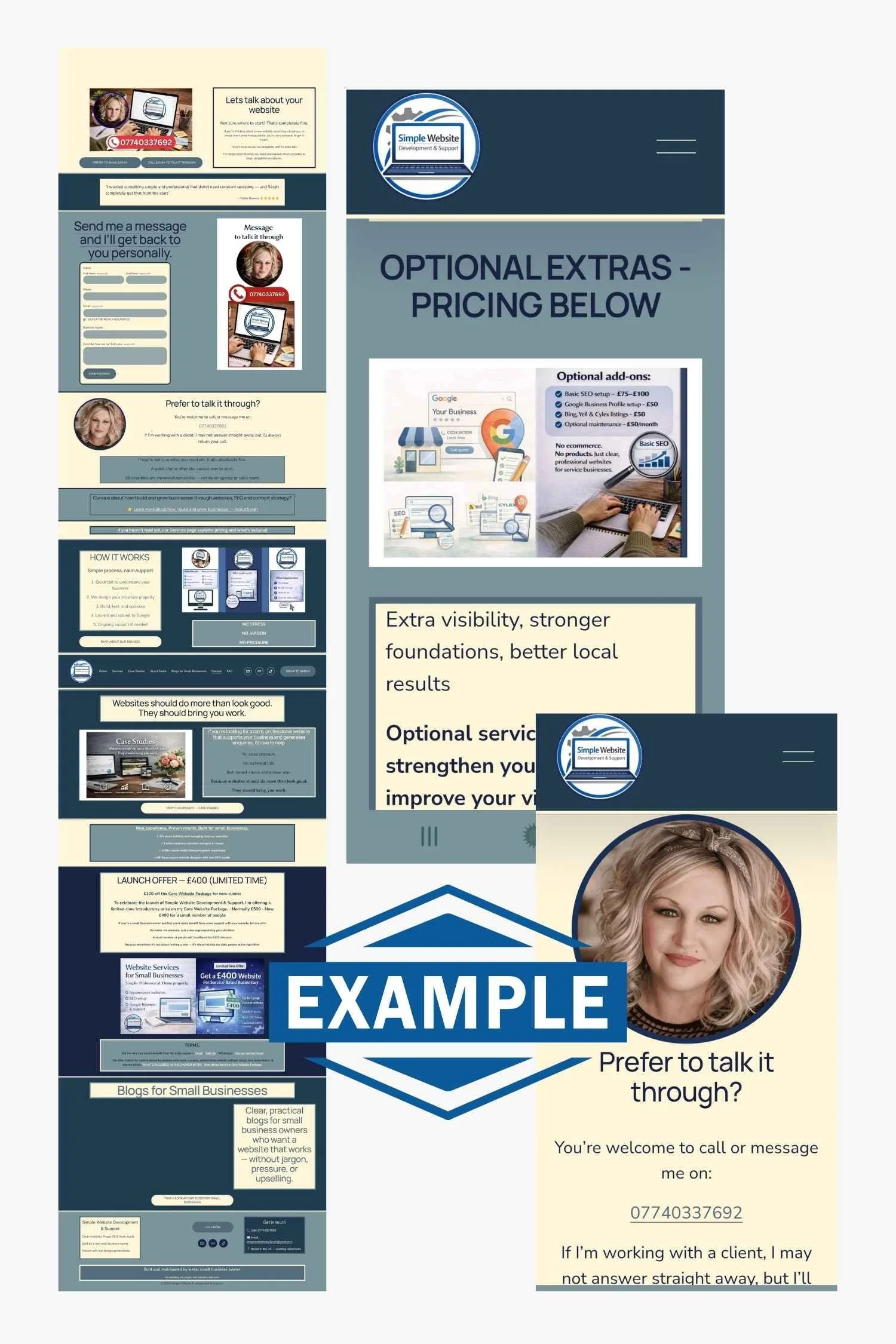
Want to know what we can help with? Read our Services Page
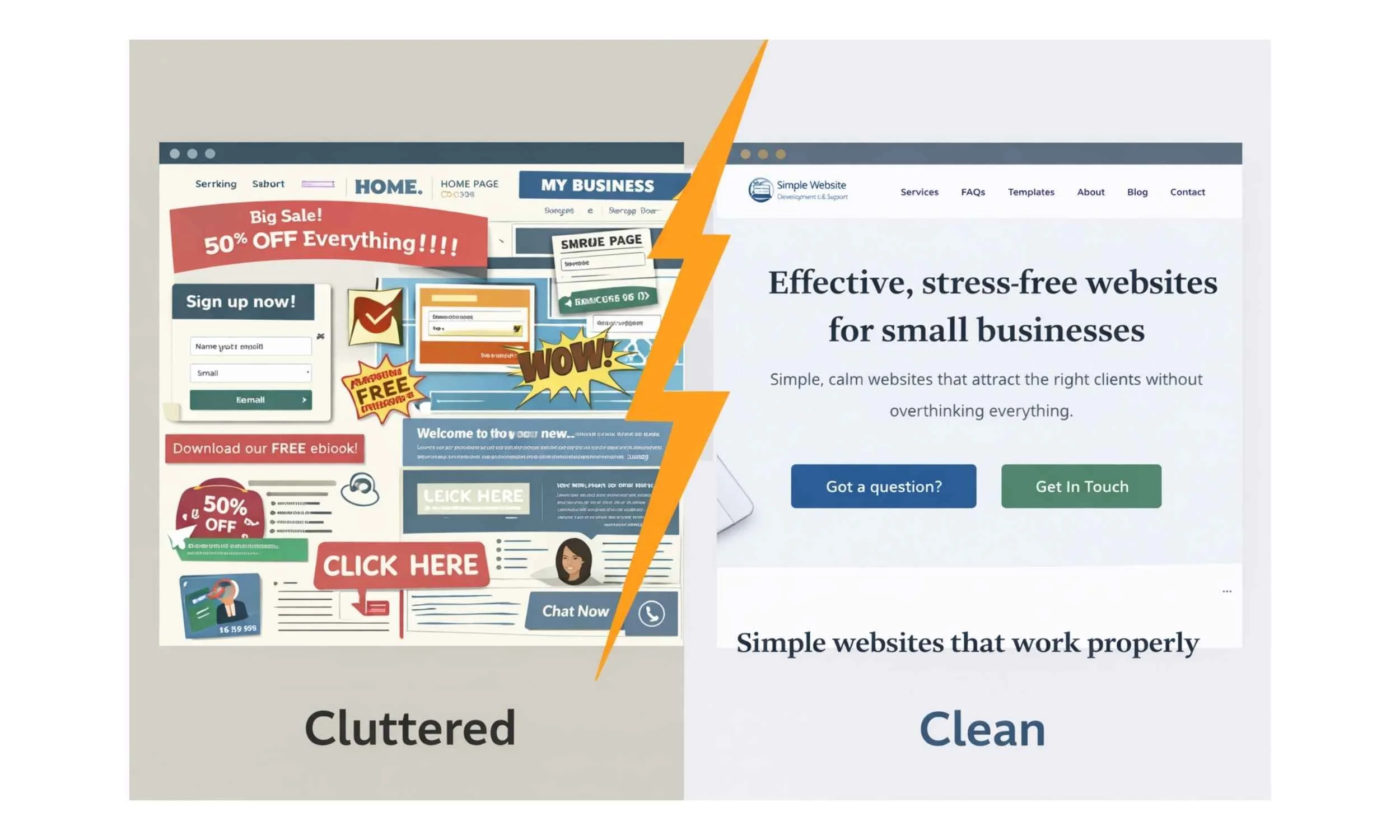
Words and Structure Matter More Than Design Trends
Design matters, but structure matters more.
Strong service websites prioritise:
Clear headings
Easy navigation
Plain language written for customers
Pages that follow a logical flow
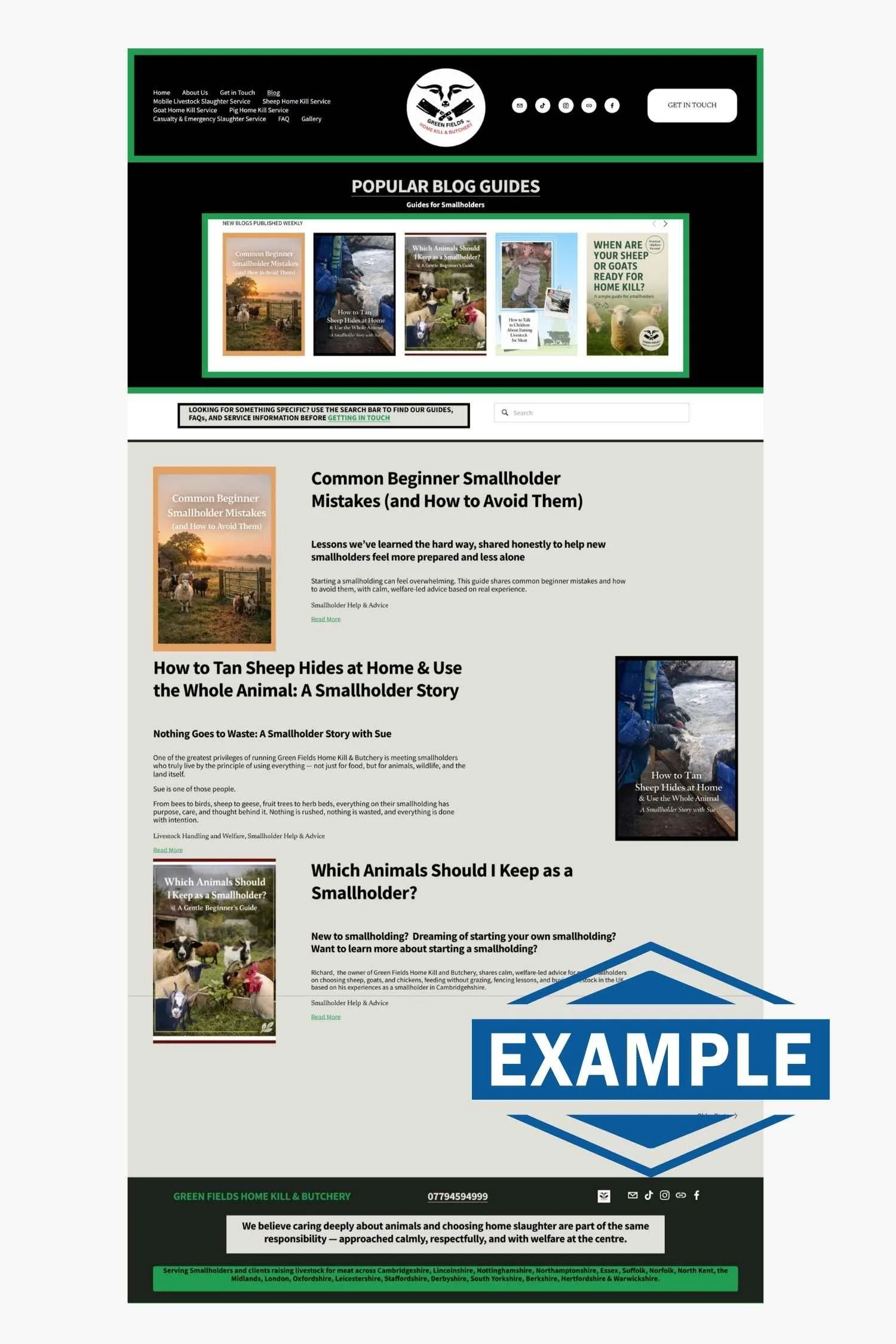
A website can look beautiful and still not work. Clarity is what turns visits into enquiries. →See our Green Fields Home Kill & Butchery Case Study to see our Google Statistics for Evidence of this in the Real World!
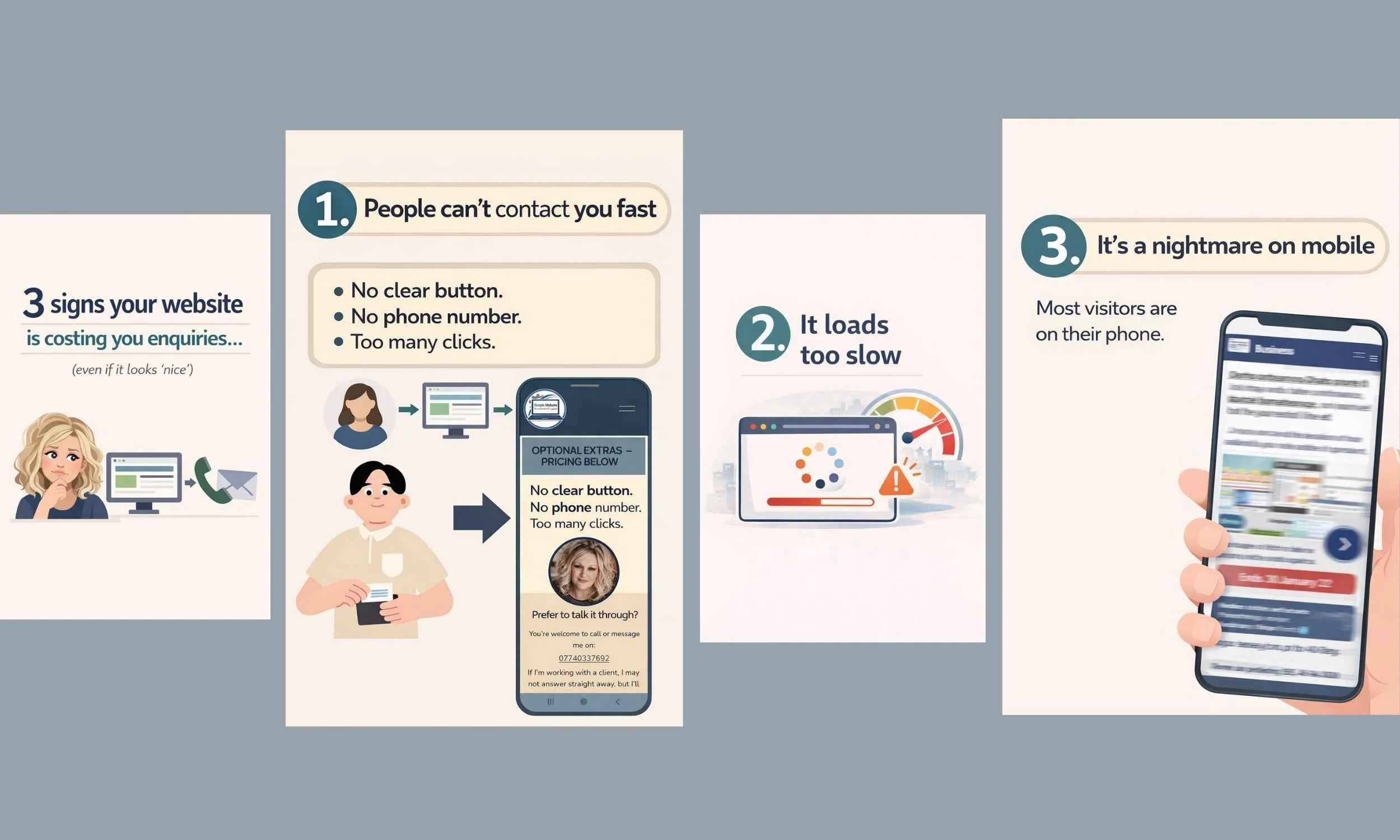
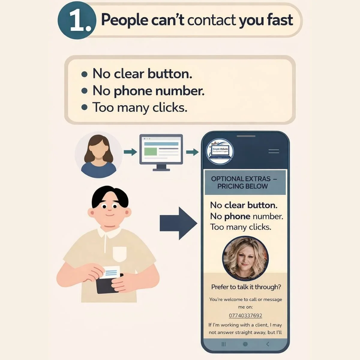
Common Simple Website Mistakes (and How to Avoid Them)
Poor mobile experience
Most visitors arrive on a phone. If a site is hard to read or navigate on mobile, they’ll leave.
Slow loading pages
Heavy images and unnecessary features drive people away before they even see your content.
Confusing navigation
If visitors can’t quickly find what you do or how to contact you, they won’t try harder.
No clear call to action
Every page should gently guide visitors toward a next step. Guessing leads to leaving.
“Walls of text” and poor readability
Large blocks of text, tiny fonts, and low contrast are off-putting. Break content up. Use space.
Outdated content
Old information makes a business look inactive or unreliable.
Broken links and errors
Small errors quietly damage trust and credibility.
Small fixes that make a big difference
Design mobile-first
Compress images and keep pages fast
Keep menus simple
Make contact visible everywhere
Use colour, spacing, and sections to guide the eye - you will see this as you read this blog!
WE PUBLISH TOP TIPS FOR YOUR WEBSITE ON OUR SOCIAL MEDIA DAILY!
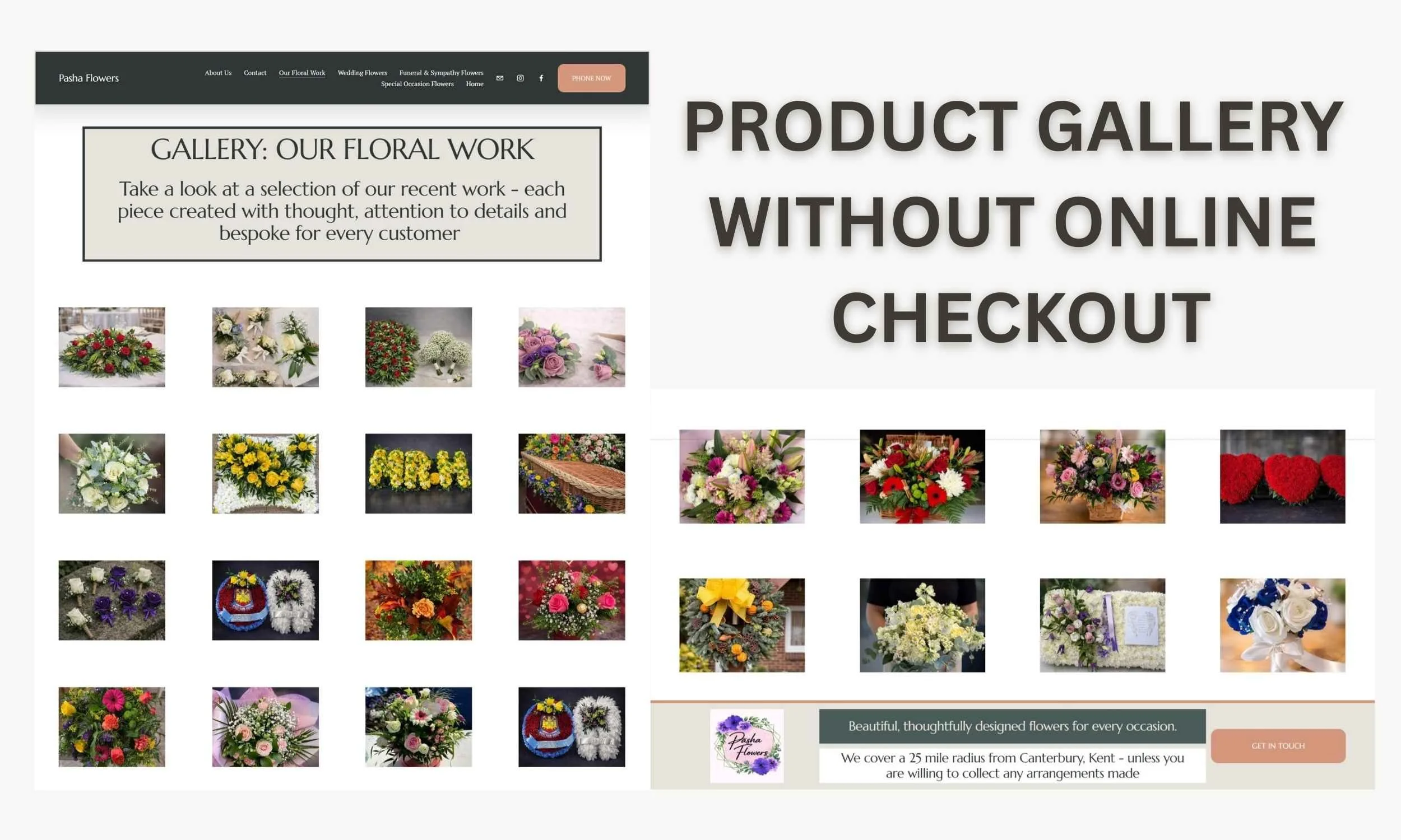
Ecommerce and Product-Based Businesses
This approach isn’t designed for full ecommerce websites with baskets, payments, and complex stock management.
However, it works very well for product-led service businesses, where:
Products or ranges are clearly explained
Strong images are used
Options and pricing are visible
Customers contact you to order rather than checking out
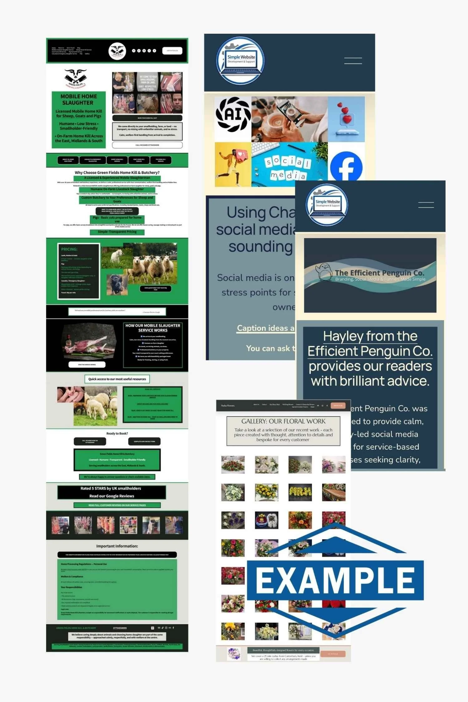
A florist-style setup is a good example — where the website builds trust and clarity, but ordering happens through conversation, which is what we created for our Pasha Florist Client →See the Image below and our Case Study
Website Images Aren’t Just “Decoration” — They’re Navigation
A lot of service business owners think they need to “fill the page with text” for their website to look professional.
But in reality, the right images can do a job that text can’t as most reader do not browse a website they scan!
Images can help people:
understand what you do instantly
stay on your website longer
click through to the right page
and feel confident enough to contact you
Images can act like an “index” for your website
If you’ve ever opened a website and felt overwhelmed… it’s usually because everything is crammed onto one page.
A much better approach is to use images as clickable sections. For example, instead of having one huge page that explains everything, you can create:
A short Services section
A row of image blocks (each one clickable)
Each image takes the visitor to a dedicated page
This keeps your website calm, tidy, and easy to scan.
The truth is, images are one of the fastest ways to build trust, especially for service businesses.
You don’t need hundreds of photos.
You just need the right ones in the right places.
The goal isn’t to “look pretty”
The goal is:
Visitor → Understand → Trust → Contact
That’s it!
And images help people move through that journey without overthinking.
A simple service website image plan (that works)
Here are some examples of images that work brilliantly on service websites:
A clear photo of you (people buy from people)
A photo of your work (or results)
A simple “how it works” graphic
A few real examples (even screenshots)
A calm gallery page for browsing
And most importantly…
Use images to guide people to the next step.
Who This Website Approach Is For (and Who It Isn’t)
This approach works well for service businesses that:
Want clarity over complexity
Value structure and calm processes
Are happy to be involved without being overwhelmed
Want a website that supports real work
It isn’t a good fit if you:
Want a full ecommerce shop with online payments
Expect constant changes mid-build
Don’t want to provide content or information
Prefer trends over clarity
And that’s okay. The right website depends on the right fit.
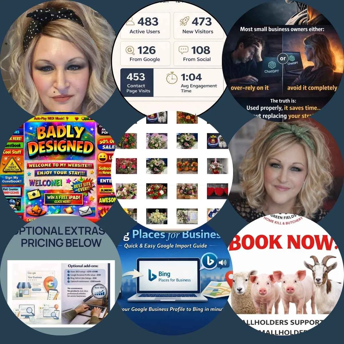
Ongoing Support and Weekly Website Tips
Building a simple, effective website doesn’t stop at launch.
We share practical website tips weekly on social media, based on real questions we see from service business owners — things like clarity, structure, small improvements, and common mistakes to avoid. I have added our Social Links below (they are also in our Header and Footer)
If you like learning in manageable pieces, these tips are designed to help you keep improving your website gradually, without overcomplicating things.
Why customers may not be contacting you after visiting your website


FOLLOW US ON YOUR FAVOURITE SOCIAL MEDIA PLATFORM SO YOU DO NOT MISS OUT ON OUR SIMPLE WEBSITE TIPS - FEEL FREE TO DROP A COMMENT ON ANY POST IF YOU HAV QUESTIONS!
Final Thoughts
If you’re thinking “I need a website”, the real question is:
What do I need my website to do for my business?
For most service businesses, the answer is simple:
Explain clearly
Build trust
Make contact easy
Support growth without stress
That’s what simple website design is really about.
Want more simple, practical website help?
You might also like:
Using ChatGPT as a Small Business Owner – What Actually Works
Quick question before you go…
Did you read this blog word for word?
Or did you scan it, find what you needed quickly, and feel like it was easy to follow?
Because that’s exactly how your customers use your website too.
HAVE QUESTIONS? USE THE SEARCH BAR BELOW TO SEARCH OUR WEBSITE
Head to our Service Page for more details by simply pressing this image